Drift Slider
A media slider staged in 3D space, the active image glides to the focal plane while its neighbours scatter back, dimming and blurring with depth.
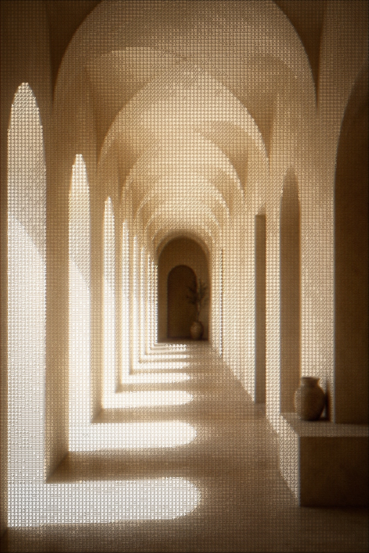
A slider that treats your media like objects in a room, not frames on a strip. Cards hang in real 3D space with a hand-scattered drift; the active one glides to the focal plane, crisp and full-contrast, while the rest fall back along the z-axis and soften like things leaving focus. One spring drives every way of moving: buttons, arrow keys, and drag all retarget the same value, so a flick mid-glide keeps its momentum instead of restarting. The entire control surface is two buttons that preview their destination, each chip carries a live thumbnail of the slide it leads to. Built with Motion.
Drag the stage and flick: a quick swipe advances regardless of distance. Click any background card to bring it forward. On a fine pointer the whole scene tilts a few degrees toward the cursor.
Installation
Complete the shared Setup first, then add Motion.
bun add motionCopy the component into components/ui/drift-slider.tsx.
'use client';import * as React from 'react';import { motion, useMotionTemplate, useMotionValue, useReducedMotion, useSpring, useTransform, type MotionValue,} from 'motion/react';import { ChevronLeft, ChevronRight } from 'lucide-react';import { cn } from '@/lib/cn';const EASE_OUT = [0.23, 1, 0.32, 1] as const;const GLIDE = { stiffness: 150, damping: 24, mass: 1 } as const;const TILT = { stiffness: 110, damping: 16 } as const;const FOCUS = 'focus-visible:outline-none focus-visible:outline focus-visible:outline-2 focus-visible:outline-offset-2 focus-visible:[outline-color:var(--drift-accent)]';const EASE_CSS = '[transition-timing-function:cubic-bezier(0.23,1,0.32,1)]';function seeded(n: number) { const x = Math.sin(n * 12.9898) * 43758.5453; return x - Math.floor(x);}const clamp = (v: number, min: number, max: number) => Math.min(max, Math.max(min, v));export type DriftSliderItem = { src: string; alt: string;};export type DriftSliderProps = { items: DriftSliderItem[]; defaultIndex?: number; accent?: string; ratio?: string; label?: string; className?: string;};export function DriftSlider({ items, defaultIndex = 0, accent = '#f0883e', ratio = '4 / 3', label = 'Image slider', className,}: DriftSliderProps) { const reduce = useReducedMotion(); const count = items.length; const last = count - 1; const [active, setActive] = React.useState(() => clamp(defaultIndex, 0, Math.max(0, last)), ); const target = useMotionValue(active); const progress = useSpring(target, GLIDE); const tiltX = useSpring(0, TILT); const tiltY = useSpring(0, TILT); const sceneTransform = useMotionTemplate`rotateX(${tiltY}deg) rotateY(${tiltX}deg)`; const [finePointer, setFinePointer] = React.useState(false); React.useEffect(() => { const mq = window.matchMedia('(hover: hover) and (pointer: fine)'); const update = () => setFinePointer(mq.matches); update(); mq.addEventListener('change', update); return () => mq.removeEventListener('change', update); }, []); const stageRef = React.useRef<HTMLDivElement>(null); const drag = React.useRef<{ id: number; startX: number; base: number; lastX: number; lastT: number; velocity: number; moved: number; } | null>(null); const suppressClick = React.useRef(false); const goTo = React.useCallback( (i: number) => { const next = clamp(i, 0, last); setActive(next); target.set(next); }, [last, target], ); const onPointerDown = (e: React.PointerEvent) => { if (drag.current) return; if (e.pointerType === 'mouse' && e.button !== 0) return; drag.current = { id: e.pointerId, startX: e.clientX, base: target.get(), lastX: e.clientX, lastT: e.timeStamp, velocity: 0, moved: 0, }; suppressClick.current = false; stageRef.current?.setPointerCapture(e.pointerId); }; const onPointerMove = (e: React.PointerEvent) => { if (finePointer && !reduce && !drag.current) { const rect = stageRef.current?.getBoundingClientRect(); if (rect) { const nx = ((e.clientX - rect.left) / rect.width) * 2 - 1; const ny = ((e.clientY - rect.top) / rect.height) * 2 - 1; tiltX.set(nx * 4); tiltY.set(ny * -3); } } const d = drag.current; if (!d || e.pointerId !== d.id) return; const dx = e.clientX - d.startX; d.moved = Math.max(d.moved, Math.abs(dx)); if (d.moved > 6) suppressClick.current = true; const dt = e.timeStamp - d.lastT; if (dt > 0) d.velocity = (e.clientX - d.lastX) / dt; d.lastX = e.clientX; d.lastT = e.timeStamp; const step = (stageRef.current?.offsetWidth ?? 640) * 0.45; let raw = d.base - dx / step; if (raw < 0) raw *= 0.35; else if (raw > last) raw = last + (raw - last) * 0.35; target.jump(raw); }; const endDrag = (e: React.PointerEvent) => { const d = drag.current; if (!d || e.pointerId !== d.id) return; drag.current = null; stageRef.current?.releasePointerCapture(d.id); const current = target.get(); let next: number; if (Math.abs(d.velocity) > 0.35 && d.moved > 12) { next = d.velocity < 0 ? Math.ceil(current) : Math.floor(current); } else { next = Math.round(current); } goTo(next); }; const onPointerLeave = () => { tiltX.set(0); tiltY.set(0); }; const onKeyDown = (e: React.KeyboardEvent) => { if (e.key === 'ArrowRight') { e.preventDefault(); goTo(active + 1); } else if (e.key === 'ArrowLeft') { e.preventDefault(); goTo(active - 1); } else if (e.key === 'Home') { e.preventDefault(); goTo(0); } else if (e.key === 'End') { e.preventDefault(); goTo(last); } }; return ( <section aria-roledescription="carousel" aria-label={label} style={{ '--drift-accent': accent } as React.CSSProperties} className={cn( 'bloom-edge relative flex w-full max-w-[680px] flex-col rounded-[14px] p-1.5', 'bg-gradient-to-b from-white to-[#f4f4f5] text-neutral-900', 'dark:from-[#1d1d1d] dark:to-[#161716] dark:text-white', 'shadow-[0_1px_2px_0_rgba(0,0,0,0.05),0_5px_14px_-10px_rgba(0,0,0,0.1)]', 'dark:shadow-[inset_0_1px_0_0_rgba(255,255,255,0.05),0_1px_2px_0_rgba(0,0,0,0.4),0_6px_16px_-10px_rgba(0,0,0,0.45)]', className, )} > <div ref={stageRef} role="group" tabIndex={0} aria-label={`Slide ${active + 1} of ${count}`} onPointerDown={onPointerDown} onPointerMove={onPointerMove} onPointerUp={endDrag} onPointerCancel={endDrag} onPointerLeave={onPointerLeave} onKeyDown={onKeyDown} className={cn( 'bloom-edge relative h-[290px] touch-pan-y overflow-hidden rounded-[11px]', 'bg-black/[0.02] dark:bg-black/20', 'shadow-[inset_0_1px_2px_0_rgba(0,0,0,0.04)] dark:shadow-[inset_0_1px_3px_0_rgba(0,0,0,0.5)]', 'cursor-grab select-none active:cursor-grabbing', 'focus-visible:outline-none focus-visible:outline focus-visible:outline-2 focus-visible:-outline-offset-2 focus-visible:[outline-color:var(--drift-accent)]', )} style={{ perspective: 1100 }} > <motion.div aria-hidden={false} style={{ transform: reduce ? undefined : sceneTransform, transformStyle: 'preserve-3d', }} className="absolute inset-0 [mask-image:linear-gradient(to_right,transparent,black_7%,black_93%,transparent)]" > {items.map((item, i) => ( <DriftCard key={i} item={item} index={i} progress={progress} ratio={ratio} active={i === active} reduce={!!reduce} onSelect={() => { if (!suppressClick.current) goTo(i); }} /> ))} </motion.div> </div> <div className="flex items-center justify-center gap-1.5 pt-2.5 pb-1"> <PreviewChip dir="prev" item={active > 0 ? items[active - 1] : undefined} onClick={() => goTo(active - 1)} reduce={!!reduce} /> <PreviewChip dir="next" item={active < last ? items[active + 1] : undefined} onClick={() => goTo(active + 1)} reduce={!!reduce} /> </div> <span aria-live="polite" className="sr-only"> Slide {active + 1} of {count}: {items[active]?.alt} </span> </section> );}function PreviewChip({ dir, item, onClick, reduce,}: { dir: 'prev' | 'next'; item?: DriftSliderItem; onClick: () => void; reduce: boolean;}) { const Chevron = dir === 'prev' ? ChevronLeft : ChevronRight; return ( <button type="button" aria-label={ item ? `${dir === 'prev' ? 'Previous' : 'Next'} slide: ${item.alt}` : dir === 'prev' ? 'Previous slide' : 'Next slide' } disabled={!item} onClick={onClick} className={cn( 'bloom-edge group relative grid h-8 w-14 place-items-center overflow-hidden rounded-lg', 'bg-gradient-to-b from-white to-[#f1f1f2] dark:from-[#272727] dark:to-[#1d1d1d]', 'shadow-[inset_0_1px_0_0_rgba(255,255,255,0.9),0_1px_2px_0_rgba(0,0,0,0.08)]', 'dark:shadow-[inset_0_1px_0_0_rgba(255,255,255,0.08),0_1px_2px_0_rgba(0,0,0,0.5)]', `transition-[transform,opacity] duration-100 ${EASE_CSS}`, 'active:scale-95 motion-reduce:active:scale-100', 'disabled:pointer-events-none disabled:opacity-40', FOCUS, )} > {item && ( <motion.img key={item.src} src={item.src} alt="" aria-hidden draggable={false} decoding="async" initial={reduce ? { opacity: 0 } : { opacity: 0, filter: 'blur(4px)' }} animate={reduce ? { opacity: 1 } : { opacity: 1, filter: 'blur(0px)' }} transition={{ duration: 0.25, ease: EASE_OUT }} className="absolute inset-0 size-full object-cover" /> )} {item && ( <span aria-hidden className="absolute inset-0 bg-black/30 transition-colors duration-200 group-hover:bg-black/10" /> )} <span aria-hidden className="pointer-events-none absolute inset-0 rounded-lg bg-gradient-to-b from-white/15 to-transparent to-40% dark:from-white/10" /> <Chevron size={16} strokeWidth={2} aria-hidden className={cn( 'relative z-10', item ? 'text-white drop-shadow-[0_1px_2px_rgba(0,0,0,0.5)]' : 'text-neutral-700 dark:text-neutral-200', `transition-transform duration-200 ${EASE_CSS}`, dir === 'prev' ? 'group-hover:-translate-x-px' : 'group-hover:translate-x-px', 'motion-reduce:transition-none motion-reduce:group-hover:translate-x-0', )} /> </button> );}function DriftCard({ item, index, progress, ratio, active, reduce, onSelect,}: { item: DriftSliderItem; index: number; progress: MotionValue<number>; ratio: string; active: boolean; reduce: boolean; onSelect: () => void;}) { const jx = (seeded(index * 3 + 1) - 0.5) * 64; const jy = (seeded(index * 3 + 2) - 0.5) * 84; const jr = (seeded(index * 3 + 3) - 0.5) * 9; const d = useTransform(progress, (v) => index - v); const transform = useTransform(d, (t) => { if (reduce) return 'translate(-50%, -50%)'; const c = clamp(t, -3.2, 3.2); const a = Math.abs(c); const sat = Math.min(a, 1); const x = c * 200 + jx * sat; const y = jy * sat; const z = -a * 240; const rotY = c * -16; const rotZ = jr * sat; const scale = 1 - Math.min(a * 0.08, 0.32); return `translate(-50%, -50%) translate3d(${x}px, ${y}px, ${z}px) rotateY(${rotY}deg) rotateZ(${rotZ}deg) scale(${scale})`; }); const opacity = useTransform(d, (t) => { const a = Math.abs(t); if (reduce) return a < 0.5 ? 1 : 0; if (a < 1) return 1 - a * 0.25; if (a < 2) return 0.75 - (a - 1) * 0.35; return Math.max(0, 0.4 - (a - 2) * 0.4); }); const filter = useTransform(d, (t) => reduce ? 'none' : `blur(${Math.min(Math.abs(t) * 2, 5).toFixed(2)}px)`, ); const zIndex = useTransform(d, (t) => 100 - Math.round(Math.abs(t) * 10)); const pointerEvents = useTransform(d, (t) => Math.abs(t) > 2.4 ? ('none' as const) : ('auto' as const), ); return ( <motion.div aria-hidden={!active} style={{ transform, opacity, filter, zIndex, pointerEvents, aspectRatio: ratio, }} onClick={onSelect} className={cn( 'absolute top-1/2 left-1/2 w-[min(56%,330px)] overflow-hidden rounded-[10px]', 'bloom-edge bg-neutral-200 dark:bg-[#242424]', 'shadow-[0_1px_2px_0_rgba(0,0,0,0.08),0_14px_30px_-12px_rgba(0,0,0,0.25)]', 'dark:shadow-[inset_0_1px_0_0_rgba(255,255,255,0.07),0_1px_2px_0_rgba(0,0,0,0.4),0_18px_44px_-12px_rgba(0,0,0,0.7)]', !active && 'cursor-pointer', )} > <img src={item.src} alt={active ? item.alt : ''} draggable={false} decoding="async" className="pointer-events-none block size-full object-cover" /> <span aria-hidden className="pointer-events-none absolute inset-0 rounded-[10px] bg-gradient-to-b from-white/10 to-transparent to-30% dark:from-white/[0.07]" /> </motion.div> );}Usage
import { DriftSlider } from '@/components/ui/drift-slider';
export default function Example() {
return (
<DriftSlider
items={[
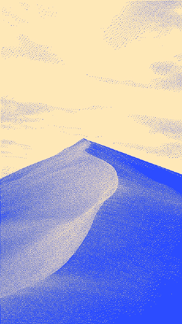
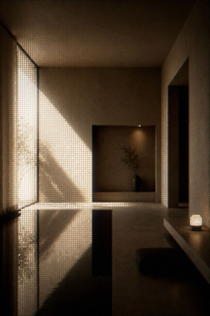
{ src: '/media/one.jpg', alt: 'Dunes at dusk' },
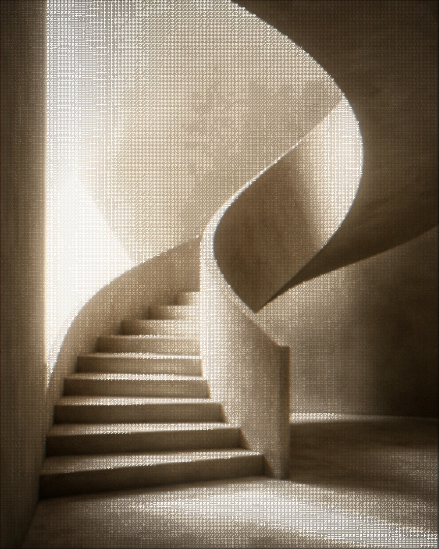
{ src: '/media/two.jpg', alt: 'Coastline from above' },
{ src: '/media/three.jpg', alt: 'Ridges at dawn' },
]}
/>
);
}Examples
The accent lives in exactly one place: the focus ring. ratio reshapes every
card.
Props
| Prop | Type | Default | Description |
|---|---|---|---|
items | { src: string; alt: string }[] | - | The slides. |
defaultIndex | number | 0 | Slide shown first. |
accent | string | "#f0883e" | Focus ring color. |
ratio | string | "4 / 3" | Aspect ratio of each card. |
label | string | "Image slider" | Accessible name for the carousel region. |
className | string | - | Forwarded to the outer panel. |
Image Reveal Mask
An image that a top-lit curtain sweeps off as it scrolls into view, with an accent light riding the reveal edge.
Arc Carousel
A carousel that fans its cards across the top of a circle, the active card rests at the apex, crisp and upright, while its neighbours curve down each slope and recede.